Appearance
Messages
Initial Messages
This setting allows for the user to set up messages that appear when the chatbot is initially launched. The user can configure the messages to appear as though it’s written by AI, a system message, or written by the human user. The user can edit and format the messages by using an editor. Markdown can also be typed manually and the results instantly show in the preview.
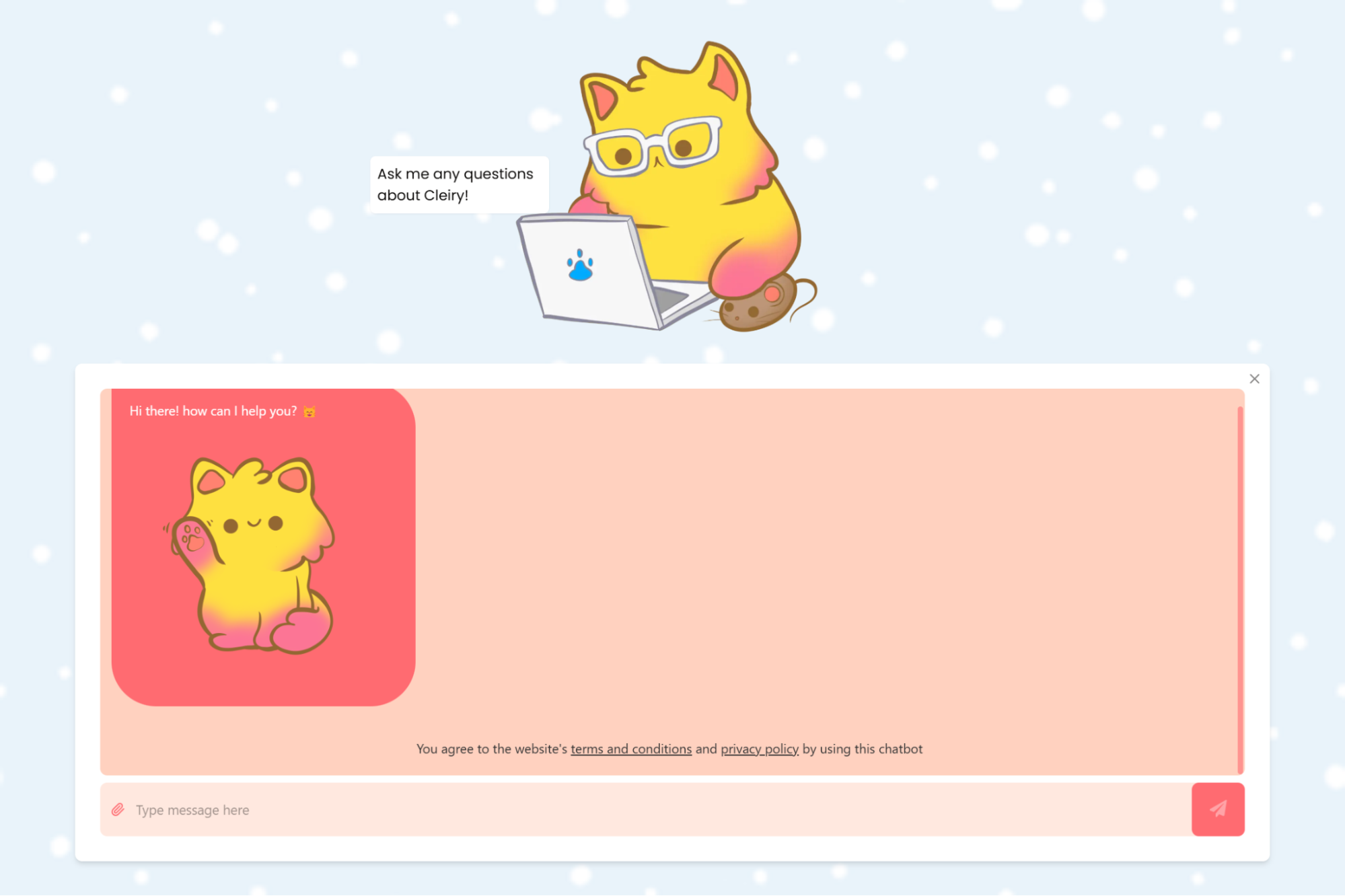
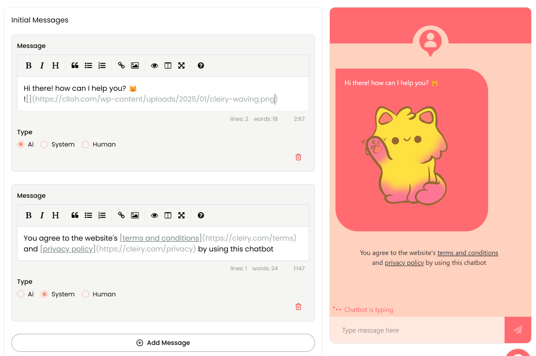 How the chatbot will look like with a mixture of AI and System initial messages.
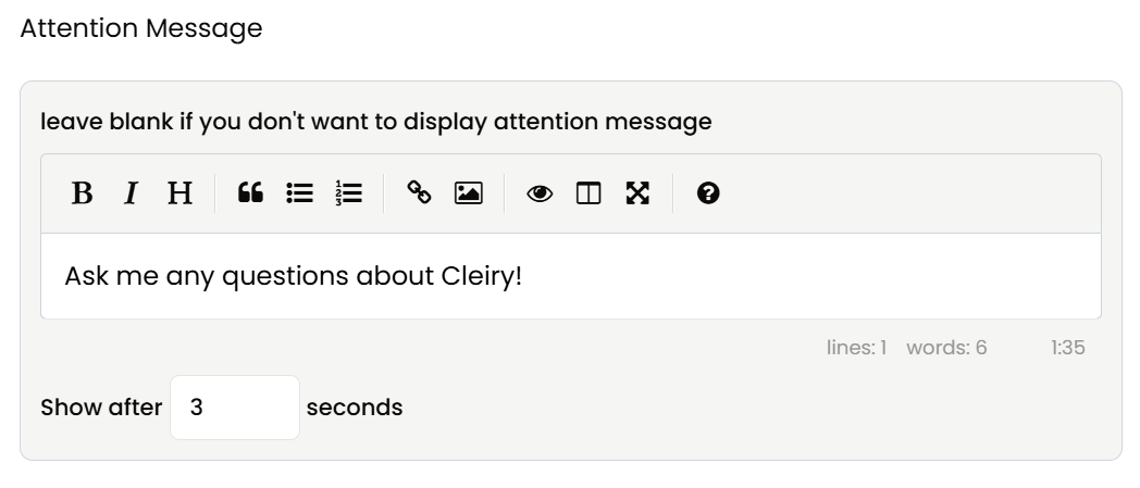
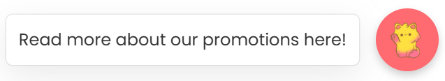
Attention Message
You can configure an Attention Message that appears beside the floating action button when the chatbot is embedded. You can also configure the timing of the message’s appearance to show X seconds after the chatbot is loaded.
Add a link in the message to a webpage with more information.
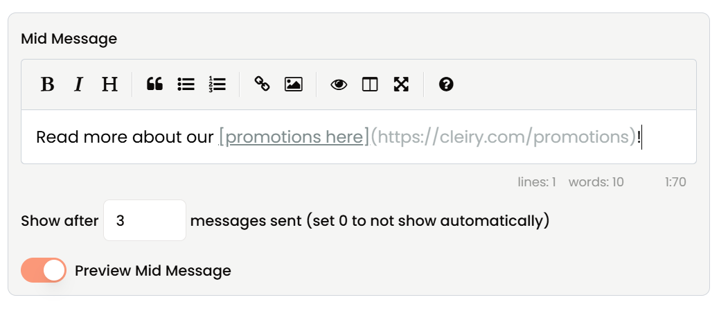
Mid Message
You can configure a different message to be shown in place of the Attention Message after a certain number of messages were sent. This helps if you want to draw special attention to some special information.
Add a link in the message to link to a webpage with more information.
Loading Text
Customize what is shown when the chatbot is loading and generating a response through the Loading Text input field.


Show Sources
If you have PDF documents and use LlamaParse integration, toggle this on to allow the chatbot to show the sources - the pages the chatbot uses to generate responses.

Chatbot Avatar
Customize the avatar that shows at the top of the chatbot window by uploading an image. A PNG image with a transparent background works best.

Colors
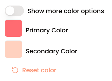
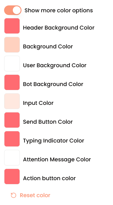
Show more color options
Toggle this to show more color options instead of just the Primary and Secondary colors.
Primary Color & Secondary Color
Customize the color of the chatbot floating action button and the chatbot window by setting the Primary Color. If the more color options toggle was enabled, you’ll find the ability to customize the colors of individual components that initially follow the Primary Color and Secondary Color, including the action button, background color, input color, message bubble color etc.
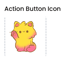
Action Button Icon
Customize the image that shows in the floating action button by uploading an image. A PNG image with a transparent background will allow the background color to be set in the colors section.
Use an image editing software to crop and add/remove spacing around the focus area of the image to make the action button look better.
Showcase Settings
Cleiry allows for a Showcase view where the entire page consists of the chat area instead of just a chat window at the bottom right of the page. The appearance of the page can be customized in the Showcase Settings area.
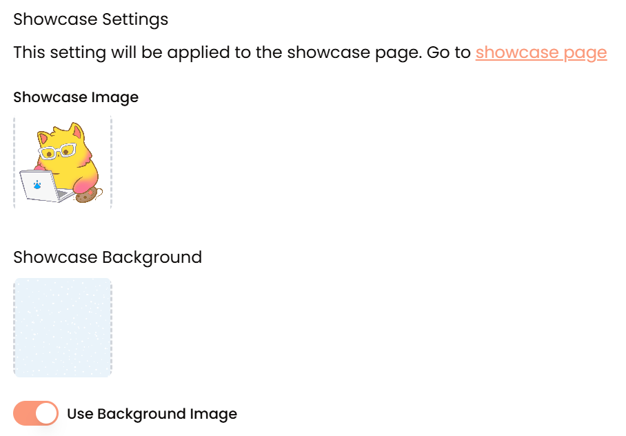
Showcase Image
This is the Showcase view’s equivalent of the Chatbot Avatar. It’ll be displayed above the chat area in the Showcase view.
Showcase Background Color
Customize the background color of the Showcase view using this setting.
Use Background Image
Toggle this to allow using background instead of setting a background color.
Showcase Background
A background image can be set to be shown in the Showcase view. The uploaded image will cover the whole area and be positioned to focus on the center of the uploaded image.